Probably the "About Us" page is one of the most undervalued. Even many companies ignore this section on their websites and blogs thinking that it cannot add value. Quite the opposite. Studies show that 52% of users want to see a “About Us” page on business websites. In fact, it is usually one of the first pages visited. That is why it is a section that has to look carefully and from DigitalMakers we want to prevent you from making these typical mistakes on this page.
What is the “About Us” page and what is it for?
Either with the name of Us or About Us, this section is intended to make our brand known to the customer by doing it empathically. It will be your cover letter, from the company and even from your employees, so this section is one that you may have to deal with more carefully.
Anyone who visits your content, surely wants to know more about who is behind the company. And it is in this section where you must find all the information you need for it.
One of the main mistakes made on this page is not knowing what to write and using very generic texts, making reading tedious for users. That is why we recommend that you take the opportunity to talk about your business highlights, challenges and achievements that only you can bring.
Another error linked to the previous point is to generate too much information. Think of this section as an introduction to your company's visitor, not their memories. If you tell a very long story you can lose the reader's attention. Try to be brief, concise, direct and creative.
Why is it so valuable?
This page will allow you to communicate the values of your business to users, and stand out from your competitors, without losing sight of the essence of your brand. This will be your digital business card.
Also think about not being careless about being boring with texts. Consider that this section is as if you had a face-to-face presentation with your clients. Give a closer and informal touch to arouse your interest and want to know your company and identify with your ideas.
Think that in this, as in any section of your website, it should not only contain text. In addition to text, this will be a good place to incorporate images and even videos, because an image is worth a thousand words and makes the experience more active. Balance the texts with other dynamic objects that bring creativity to your content.
What should it contain?
Apart from publicizing your company's history, in this section you can incorporate content that adds value to your company. This is the right place to disconnect and stand out from other companies in your same sector. Explain what you can contribute and what your strengths are.
Although it is interesting to incorporate objective data, numbers and statistics are just that, data. It is okay to include them, but in their fair measure and if they are important. All companies have information about their achievements and challenges.
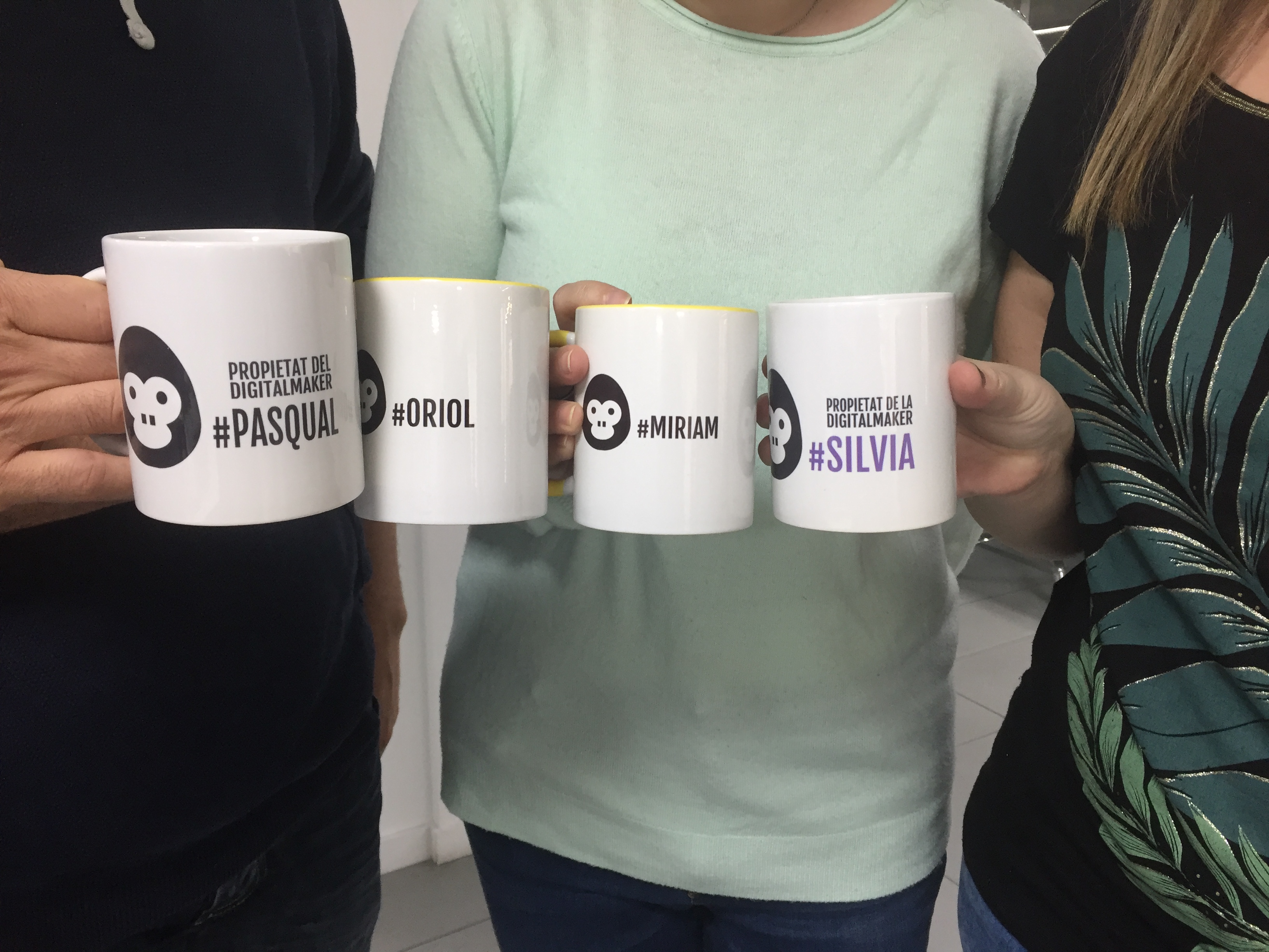
You can also incorporate your most prominent employees. You can make small presentations of employees and managers. It's about showing who each of the people behind is; This information allows to humanize the photographs and the site.
It is important that you add something that only you have: the opinions of your satisfied customers. That will help increase your truthfulness, always treating you with humility, without wanting to turn it into a showcase of achievements and trophies.
As happened with the previous point, one of the most common confusions with this section is to confuse it with a shop window and incorporate advertising in it. This page is intended to create a solid relationship with the client, and advertising does not help on this issue and can even generate rejection by the user.
Therefore, it is better to incorporate other contents that support you in the task of fostering a link with the client such as a contact form for your questions or a CTA (call to action or call to action) that leads them to subscribe to your newsletter It is also good to show content that may interest you, such as your last articles on the blog, show a map of where you are or indicate that they follow you on social networks. Try to keep your content updated periodically and thus show that your company is always moving and expanding.
And finally, and surely the error par excellence, it is difficult to find this section on your website. All this hard work is of no use if the client is unable to find all this information, because it is poorly visible or his name is very complicated. It is essential to think with simplicity and give it a consistent name, be it "We", "Our Team or Company" or "Who we are".
Taking into account the points that we have mentioned so far, we hope that you can now benefit from the advantages of this section on your website and, if you already had it, you can identify if you have made a mistake and correct it. If you have any questions or queries about this or other marketing issues, consider taking advantage of the challenge we have #askdigitalmakers.

")


